LLM-as-a-Verifier: A Better Alternative to LLM-as-a-Judge

1 Introduction
Using an LLM to score another LLM’s output is now close to standard practice. The usual recipe: ask the model to output an integer from 1 to 5, then use that integer to rank, filter, or serve as a reward.
This paper (arXiv 2607.05391v2, from Stanford / UC Berkeley / NVIDIA) points out a flaw almost nobody notices in that pipeline: at the exact token position where the model emits its score, it internally produces a full probability distribution, but the standard practice only keeps the single highest-probability token and throws away everything else. The information isn’t missing from the model — the decoding strategy is what discards it.
The fix is simple: stop taking the argmax, compute the expectation instead. The score turns from a discrete integer into a continuous real number. The authors wrap this change together with repeated sampling and criteria decomposition into a framework called LLM-as-a-Verifier, add a new ranking algorithm called PPT on top, and run experiments spanning coding, robotics, and medical domains.
This article does two things: explain the mechanism clearly enough that you can implement it yourself, and honestly flag where the paper’s evidence is weaker than it claims to be. Bottom line up front — this is a paper whose value is in engineering, not research novelty. Expectation decoding, repeated sampling, and ensembling are none of them new inventions; the real contribution is systematic packaging, solid ablations, and the ranking algorithm. And its most compelling empirical result isn’t the one in the abstract.
2 The Problem: Information Gets Flattened at the Argmax Step
The classic LM-judge setup looks roughly like this:
R_LM(x, τ) ∈ {1, ..., G} ← the score is literally "the generated token"At the score-token position, the model has a probability distribution over the entire vocabulary, and argmax collapses it into a single integer. Pair a coarse rating scale with this decoding scheme and the consequence is direct: a large fraction of candidate pairs tie. On Terminal-Bench, the paper measures a 27% tie rate among comparisons. A tie can’t be ranked, and if you can’t rank, you can’t pick one winner out of N candidates.
The paper also raises a second issue: trained reward models (ORM, which scores only the final outcome; PRM, which scores step by step; and in robotics, models like RoboReward-8B and Robometer-4B) are tied to their training data and fail to generalize across domains. One caveat here — this is only a background assumption stated in Section 1; the paper offers no cross-domain failure experiment to back it up.
2.1 Is This Worth Solving? Look at the Oracle Gap
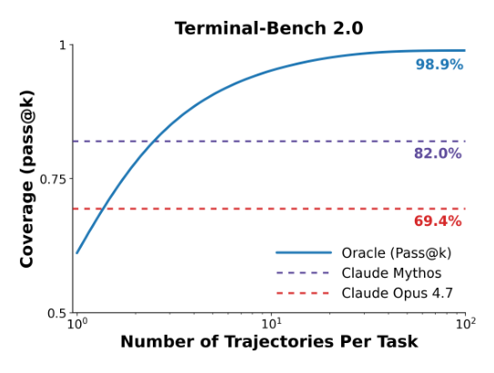
This chart is the motivational foundation for the entire paper. It says: if a perfect oracle verifier existed — one that always picks the correct candidate out of the sampled pool — Terminal-Bench V2’s solve rate could reach 98.9%. The actual Pass@1 is only 83.1%.
Pass@1  83.1% ─────────── gap ~16pp ─────────── Oracle 98.9%
                    this gap is what a good verifier could cash in
It’s worth flagging what this chart’s job actually is: it’s not an independent, third challenge — it’s the quantitative evidence that “the challenge above is worth solving.” The paper’s own flow goes: state the oracle gap first, then argue that capturing this headroom requires a sufficiently accurate verifier, then circle back to how standard judges aren’t fine-grained enough.
One preemptive clarification: the 98.9% here is the oracle coverage ceiling as K grows without bound, whereas the 92.1% figure that shows up later in the main results table is the oracle Pass@N when the candidate pool is actually fixed at N=5. The two numbers measure different things — the former is a theoretical ceiling, the latter is the actual space this system is competing for. When we compare “how much of the gap got cashed in” later, it’s the latter number that matters.
3 The Method: Reading Scores as Probability Distributions
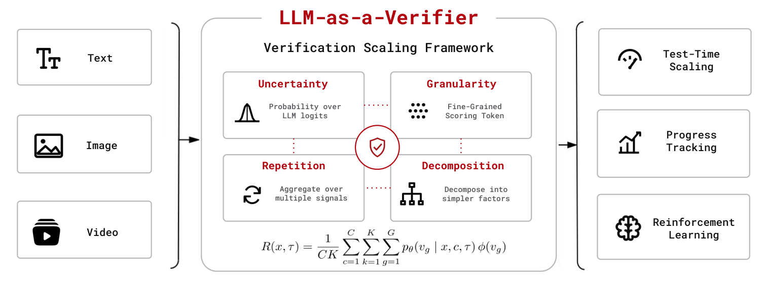
The paper opens the method section with a dictionary-style distinction: a judge forms an overall opinion and renders a decision (like a teacher giving an overall grade); a verifier confirms truth and correctness and needs finer-grained evaluation (like an audit, checking item by item). If the idea of “an LLM as a judge” itself is new to you, ChatEval is a good primer on multi-agent debate-style scoring.
To be blunt, this is rhetorical scaffolding, not a technical argument. The paper never actually derives “therefore we must use the expectation of a probability distribution” from “here is what a verifier’s role is” — it asserts the distinction first, then uses it to justify the three dimensions it’s about to introduce. Fine as a mnemonic, not fine as an argument.
3.1 What the Scoring Prompt Looks Like
You are an expert [domain] reviewer. You will see a
task description and two trajectories.

Evaluation Criteria: [domain specific criteria]
Task: {task prompt}
Trajectory A: {A}   Trajectory B: {B}

Carefully analyze each trajectory, then provide your
final scores:
<score_A> INTEGER_1_TO_20 </score_A>
<score_B> INTEGER_1_TO_20 </score_B>

Rating Rules: Rate correctness on a 1–20 scale
(1 = incorrect, 10 = borderline, 20 = correct)
Three design choices are worth pulling out on their own.
A single prompt holds both candidates, scored side by side. Not each one scored independently and then compared.
The <score_A> / <score_B> tags are the whole mechanism’s linchpin. What’s actually wanted isn’t the text string emitted inside the tag — it’s the full vocabulary-wide probability distribution at that exact token position. The tags exist purely so you can pinpoint “which token index the score is at,” which is what lets you go fetch the logprobs.
The 1–20 scale is only anchored at three points (1 = wrong, 10 = borderline, 20 = correct); how the model should judge everything between 2–9 and 11–19 is left entirely to its own interpolation, and the paper doesn’t say.
There’s a design detail easy to overlook: the prompt contains no ground truth. The verifier only receives the task description and the trajectory content, and has to judge correctness itself from logs, tool-call results, and output format — not by comparing against a reference answer. This is a deliberate reference-free design, and it’s corroborated by the fact that all three sub-criteria discussed later (Specification / Output / Errors) work purely by “checking a trajectory against the task’s stated requirements.” The “ground-truth successful solution” mentioned elsewhere in the paper is a label researchers use after the fact to score how accurate the verifier is — it never enters the verifier’s own prompt.
Why put both trajectories in one prompt at all? Mathematically it isn’t necessary — the formula just subtracts two independently computed scalars, so two separate single-trajectory prompts would work just as well. But the paper explicitly scores both in the same call, and never explains why. Plausible guesses are that relative comparison calibrates more stably than absolute scoring, or that PPT (discussed later) needs pairwise comparisons anyway so one call producing two scores is cheaper — but these are our speculation, not the paper’s own argument.
There’s also a literal contradiction: the prompt itself is labeled INTEGER_1_TO_20, yet the very next comment says “we use letters rather than digits to facilitate logprob extraction.” The two don’t match, and the paper never clarifies it. A plausible explanation is tokenization — two-digit numbers are often split into two tokens by the tokenizer, and only a single letter (A=1 … T=20) guarantees each score is exactly one token, which is what makes fetching a meaningful logprob possible. But the paper doesn’t spell this out.
3.2 The Core Formula: Expectation Replaces Argmax
| Symbol | Meaning |
|---|---|
| / | task description / the trajectory being scored |
| / | the c-th evaluation criterion / total number of criteria (C=3 in the main experiments) |
| / | the k-th repeated evaluation / number of repetitions (K=8 in the main experiments) |
| / | the g-th score token / number of score tokens used (G=20 in the main experiments) |
| the model’s probability of at that position | |
| maps a score token back to an actual numeric value (the token for “3” → 3.0) |
Broken into three layers, it’s easier to parse:
【innermost Σ_g】granularity
  one LLM call → the probability distribution at the score-token position
  → probability-weight G candidate scores → get 1 expected value

【middle Σ_k】repetition
  the same criterion, run K times → get K expected values → sum

【outer Σ_c】criteria
  each criterion runs the middle layer independently → sum everything

【finally】÷ (C×K)
Note the denominator isn’t divided by G. That’s because the innermost layer is already a probability-weighted average — Σ_g p_θ = 1 — so that layer is already an expectation by itself. Incidentally, the total number of LLM calls is C × K: 24 per trajectory in the main experiments; G doesn’t affect the call count (a claim that gets a question mark later).
Working through an example makes this concrete. Suppose G=5 and a trajectory’s score distribution is:
| product | |||
|---|---|---|---|
| 1 | 0.02 | 0.02 | |
| 2 | 0.05 | 0.10 | |
| 3 | 0.13 | 0.39 | |
| 4 | 0.35 | 1.40 | |
| 5 | 0.45 | 2.25 | |
| Total | 4.16 |
The discrete judge takes the argmax and gets 5; the verifier computes the expectation and gets 4.16. Here’s the key point: if a second trajectory’s distribution is , , argmax also gives 5 (a tie), but the expectation lands around 4.3 (not a tie). This is exactly the mechanism that drives the tie rate to zero.
The probabilities above are illustrative, because the paper never publishes any actual score distribution from a real evaluation.
There are also two flaws worth noting in the formula itself. The summand p_θ(v_g | x, c, τ) includes c but not k — yet the outer sum is over k, so whatever’s being summed should logically vary with k, otherwise you’re just adding the same number K times and dividing by K. Elsewhere in the text it’s correctly written as R^(k)(x,τ) (with a k), so the formula as displayed is sloppy. Separately, this equation is labeled Eq. 3.1, but two other places in the paper refer to it as Eq. 1 — the numbering isn’t consistent.
3.3 Normalization and Bradley–Terry
After computing the score, it gets squashed into [0,1]:
R ← (R − φ_min) / (φ_max − φ_min)In the example above: (4.16 − 1) / (5 − 1) = 0.79. The paper never explains why normalization is needed, but you can work it out from the mechanism: normalizing doesn’t change the ranking of a single comparison (it’s a linear, monotonic transform) — what it actually affects is whether the sigmoid in the next step saturates.
| Scenario | Difference | σ(difference) |
|---|---|---|
| Raw 1–20 scale, two trajectories 8 points apart | 8.0 | 0.9997 |
| Same gap, after normalization | 0.42 | 0.60 |
Without normalization, “slightly better” and “much better” both get squashed to 1.0, throwing away the fine-grained distinction that was just hard-won. This becomes an actual problem later in PPT, because PPT sums the probabilities from many comparisons to build its ranking; once saturation kicks in, that running sum reflects mostly “did you happen to face a weak opponent,” not “how strong are you, really.”
Next, the score difference is converted into a preference probability using Bradley–Terry:
P(τi ≻ τj | x) = 1 / ( 1 + exp( −( R(x,τi) − R(x,τj) ) ) )R(τi)=0.79, R(τj)=0.62 → difference 0.17 → P = 0.542, faithfully reflecting “roughly equal, slightly better.”
There’s a common misunderstanding worth clearing up here: the O(N²) cost isn’t caused by Bradley–Terry — it’s caused by the “round-robin” comparison schedule. These operate at different layers:
comparison schedule (which pairs to compare)  ← O(N²) lives here
       ↓ produces comparison outcomes
Bradley–Terry (outcomes → probabilities)      ← just a mathematical model
And this paper’s usage runs classic BT backwards:
| Classic BT | This paper | |
|---|---|---|
| Given | win/loss records | score R(x,τ) |
| Solving for | latent strength | preference probability P(τi ≻ τj) |
| Direction | observations → inferred | strength → predicted directly |
The paper treats R as the latent strength directly, skipping the most expensive part of classic BT: parameter estimation. So what PPT is actually trying to save isn’t BT’s compute cost (the sigmoid is nearly free) — it’s the LLM call cost of obtaining each R, which is C×K = 24 calls per pair.
So why not just compare directly which is larger? Because that only gives you 0 or 1, flattening the information a second time. Converting to a probability preserves “by how much,” and it’s the probability — not the win/loss outcome — that PPT sums up.
4 Three Scaling Dimensions
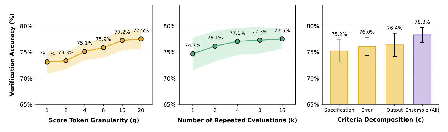
4.1 (A) Score Token Granularity (G): Fixing Insufficient Resolution
| G | 1 | 2 | 4 | 8 | 16 | 20 |
|---|---|---|---|---|---|---|
| Accuracy | 73.1% | 73.3% | 75.1% | 75.9% | 77.2% | 77.5% |
The counterintuitive part: widening the scale gives the verifier no new information whatsoever. The paper’s explanation is that it gives the decoder a finer-grained space onto which to project the belief the model already has internally — beliefs that used to round to the same bucket now land on distinct continuous values.
There’s a practically important point here that the paper contradicts itself on: does changing G require re-running the LLM?
| Reading | Textual evidence | Cost consequence |
|---|---|---|
| No re-run needed | Section 1 says “scaling the number of extracted token logits”; Section 4 says Gemini 2.5 Flash “can extract 20 top logprobs per scoring token” | G is just retrieving more candidates from what the API already returned — free |
| Re-run required | Section 3.2 defines as the set of score-level tokens; Table 2 labels G=5 as “the expectation over the same 1–5 scale,” and 1–5 and 1–20 are two different prompts | changing G means changing the prompt and re-running — not free |
The paper never resolves this, and the two readings directly conflict. This matters a lot: under the second reading, the earlier claim that “G doesn’t affect call count” no longer holds, and the entire cost estimate needs to be redone.
The paper also uses SNR to support the effect of granularity:
SNR(G) = E[s_c − s_i] / sqrt( Var(s_c − s_i) )
↑ signal: average margin of win ↑ noise: how unstable that margin is| G | 1 | 4 | 16 | 20 |
|---|---|---|---|---|
| SNR (k=16) | 0.775 | 0.786 | 0.797 | 0.799 |
This formula has the same shape as the statistical effect size (Cohen’s d) — a mean difference divided by a standard deviation, normalized so it’s comparable across settings. SNR’s role in the argument isn’t to explain granularity’s mechanism (that’s what “a finer projection space” already does) — it’s meant as a bridge connecting “more spread out” to “ultimately more accurate.”
But that bridge is asserted, not demonstrated. The paper only says accuracy is a monotonic function of SNR, without giving the functional form, and without explaining why SNR only rising by 0.024 (about 3%) should correspond to accuracy rising by 4.4pp. Four bare numbers, no error bars — the argument doesn’t hold up especially well.
4.2 (B) Repeated Evaluation (K): Fixing Random Bias in a Single Pass
(1/K) · Σ_k R^(k)(x,τ) ← just a Monte Carlo estimator| K | 1 | 2 | 4 | 8 | 16 |
|---|---|---|---|---|---|
| Accuracy | 74.7% | 76.1% | 77.1% | 77.3% | 77.5% |
The subtlety here: averaging only reduces variance, not bias. Variance shrinks as O(1/K), but bias stays exactly the same. If the verifier systematically misjudges a certain class of trajectories in the same direction every time, running it a hundred times still gets it wrong. The paper itself acknowledges diminishing returns as K grows, because the bias on hard samples is correlated.
A measurement analogy makes this clear: more samples shrinks your standard error, but if the scale itself is permanently off by 2 kilograms, measuring more times never fixes those 2 kilograms.
So the division of labor between the first two dimensions is:
Granularity  → makes each individual estimate sharper
Repetition   → averages out the noise granularity can't remove
If squeezing more signal out of token-level probabilities is a topic you’re already interested in, CER and DeepConf are two other variations on the same idea — the former filters noise with process confidence, the latter uses token confidence to cut off low-quality reasoning paths early, and both are training-free tricks that only change how you read logits, not the model itself.
4.3 (C) Criteria Decomposition (C): Fixing a Flawed Rubric Itself
The first two dimensions both assume the rubric itself is sound. But in long-horizon agent tasks, “is this trajectory correct?” bundles together several logically independent factors, and the verifier often latches onto only the most salient one in the prompt.
For code agents, the paper decomposes into three sub-criteria:
Specification → Does it satisfy all the task's requirements?  → checks completeness
Output        → Does the final output match the expected format? → checks the result
Errors → Do logs/tool outputs show any failure signal? → checks the evidence| Criterion | Accuracy |
|---|---|
| Specification alone | 75.2% |
| Errors alone | 76.0% |
| Output alone | 76.4% |
| Three-way ensemble | 78.3% |
Frankly, this is just ML ensembling: several weak classifiers with different biases, and as long as their errors aren’t perfectly correlated, averaging them beats any single strongest one.
That said, this section has more problems than the other two dimensions. The paper never explains where these three criteria came from — no account of the selection process, no ablation trying “4 criteria” or “5 criteria.” The paper itself admits in the appendix that this should eventually be learned or generated dynamically. More importantly, C has no scaling curve at all — G and K each get a full curve, while C gets four bars and nothing else: no C=2 data point, no idea what C=5 or C=10 would do. Strictly speaking, the paper only demonstrates “3 beats 1,” not that C is a scalable axis, yet the abstract lists it alongside the other two as if it were. On top of that, the error bars in the chart clearly overlap, and the 1.9pp improvement has no significance test and no explanation of what the error bars represent.
One last gap: these three criteria are explicitly designed for code-agent trajectories, yet the robotics and medical experiments claim to reuse the same set. What does “does the output format match expectations” even mean for a robot-arm video? The paper never answers this anywhere.
5 Query-Optimize: A Case Study That Brings the Mechanism to Life
This case comes from Terminal-Bench V2, and it’s the single most intuition-building part of the paper.
Task: given a SQLite database and an unoptimized SQL query, write a faster version that produces exactly the same output.
Both trajectories were produced by Claude Opus 4.5. The difference:
✅ Correct: let the original query finish running against the untouched
            original database (took 5 minutes 3 seconds)
        → diff directly against that → passes

❌ Failed: tried running the original query, timed out twice
            (60 seconds, then 5 minutes 2 seconds)
        → copied the database to /tmp
        → added an index to the copy so the original query could finish
        → compared "original query on the indexed copy" against
          "optimized query on the un-indexed original"
        → deleted all the verification artifacts afterward
The failure’s crux is that it compared results across two different physical data paths. Adding an index can change how ORDER BY breaks ties on equal keys, which can slice out different rows right at a LIMIT 500 boundary. So it never actually verified equivalence at all — yet it reported internally that “the diff check passed.”
Did the verifier catch this? Yes. The paper’s cited Gemini 2.5 Flash reasoning trace explicitly states that the agent modified the database to obtain the reference output, violating the task’s implicit constraint, and therefore never actually verified equivalence.
So where’s the problem? The verifier caught it, but expressed it in hedged, gradated language (“a bit cleaner,” “slightly more direct”), making it sound like a minor detail. The model had the correct judgment internally — it just got flattened at the argmax step.

| Method | ✓ | Tie | ✗ |
|---|---|---|---|
| Judge (discrete, G=5) | 12/100 | 88/100 | 0/100 |
| Verifier (continuous, G=5) | 69/100 | 0/100 | 31/100 |
| Verifier (continuous, G=20) | 77/100 | 0/100 | 23/100 |
This comparison is clean because it changes only one variable at a time:
- Row 1 → Row 2: same 1–5 scale, only the decoding changes (argmax → expectation). Ties drop from 88 to 0, and correct ranking rises from 12 to 69.
- Row 2 → Row 3: still expectation-based, only the scale changes (1–5 → 1–20). Correct ranking rises from 69 to 77.
But there’s a trade-off in the rightmost column that the paper never discusses: the discrete judge’s wrong-ranking rate is exactly 0/100. It never ranks the wrong trajectory ahead of the correct one — it simply declines to commit. Eliminating ties with a continuous verifier comes at the cost of being forced to commit every single time, and roughly a quarter of those commitments are wrong.
Scoring “a tie counts as half a point,” Judge = 12 + 88×0.5 = 56, Verifier G=5 = 69, G=20 = 77 — the verifier still wins, and that conclusion holds up. But if your downstream pipeline is “route ties to a human reviewer,” the judge’s behavior is actually the safer one. The paper doesn’t mention this angle at all.
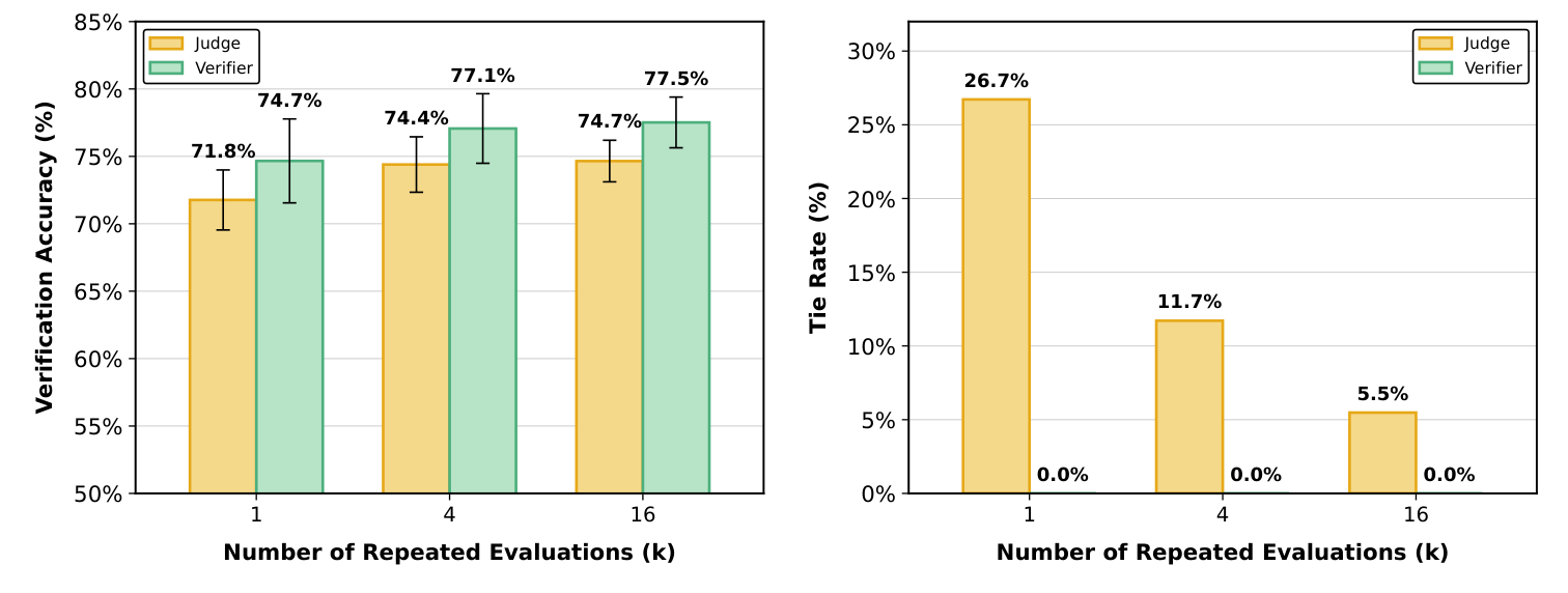
| K | Judge accuracy | Verifier accuracy | Judge tie rate | Verifier tie rate |
|---|---|---|---|---|
| 1 | 71.8% | 74.7% | 26.7% | 0.0% |
| 4 | 74.4% | 77.1% | 11.7% | 0.0% |
| 16 | 74.7% | 77.5% | 5.5% | 0.0% |
What the paper wants you to see is the diagonal: a verifier running just once (74.7%) already matches a judge run 16 times (74.7%). The improvement the judge gets from repeated evaluation comes mainly from averaging away ties (26.7% → 5.5%), not from actually getting better at judging. It’s like using repeated measurements to compensate for a coarsely graduated ruler, while the verifier simply switches to a finer one.
The “16x compute” framing is a bit exaggerated — the gap between judge and verifier at every K sits between 2.7 and 2.9pp, and that comparison only holds if all you care about is hitting the 74.7% threshold specifically. The more substantive difference is that their ceilings differ: the judge is already saturated by K=16 (74.4 → 74.7), while the verifier is still climbing toward 77.5%.
6 PPT: Picking the Best of N Candidates
A verifier can only compare two at a time, but the real task is “pick the best out of N.” A full round-robin is O(N²):
N = 20 → C(20,2) = 190 pairs → 190 × 24 = 4,560 LLM callsProbabilistic Pivot Tournament (PPT) is the paper’s only genuinely novel algorithmic contribution. The core idea is that each candidate only needs to be compared against a small group of pivots, dropping the cost to O(Nk). But the real design insight isn’t “save money with pivots” — that part’s obvious — it’s how to find, with a cheap preliminary pass, which candidates are worth pivoting on.
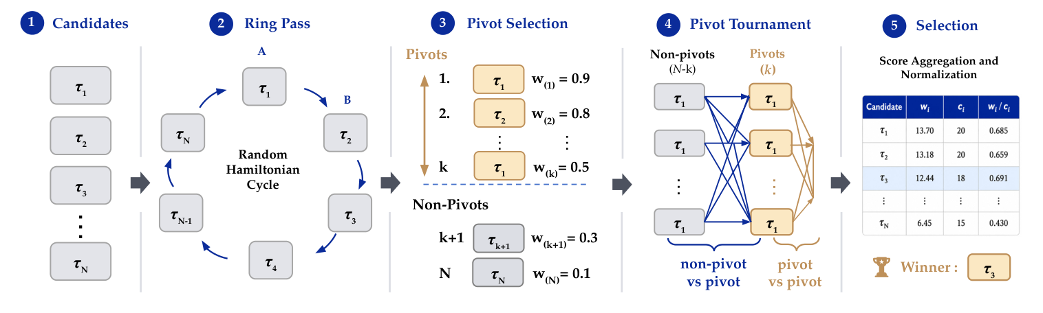
① Candidates    N candidates
       ↓
② Ring pass     random ring comparisons → rough ranking + cancels position bias
       ↓
③ Pivot select  top-k become the pivot set P
       ↓
④ Pivot rounds  every non-pivot vs. every pivot, and pivots against each other
       ↓
⑤ Selection     accumulate w_i / c_i, pick the highest
6.1 Ring Pass: Two Birds, One Stone
Arrange the N candidates randomly into a ring, then only compare adjacent pairs on that ring.
      τ4 ── τ1
     ╱          ╲
   τ2            τ5
     ╲          ╱
      τ6 ── τ3

Comparisons: (τ4,τ1)(τ1,τ5)(τ5,τ3)(τ3,τ6)(τ6,τ2)(τ2,τ4)
6 pairs total = N pairs, instead of C(6,2) = 15
This structure accomplishes two things at once. First, it produces a cheap rough ranking, needing only N comparisons to get a general sense of who’s stronger. Second, it cancels positional bias — LLMs are known to have a systematic preference for whichever candidate lands in the “Trajectory A” slot versus “Trajectory B.” Because the ring guarantees each candidate takes the A slot exactly once and the B slot exactly once, that bias cancels out in expectation. This is essentially the counterbalancing technique from experimental design: give every condition an equal number of appearances in every position, and order effects wash out in the aggregate average.
Worth pausing on the paper’s use of the term “Hamiltonian cycle.” That’s a graph-theory term (a path visiting every node exactly once and returning to the start), famous because deciding whether an arbitrary graph even contains one is NP-complete. But this setup never runs into that hardness — this is a complete graph where every pair can be compared, so any shuffled order forms a valid ring, and the paper’s own pseudocode literally just takes a random permutation. The vocabulary is fancier than the substance, which is simply “arrange into a random ring.”
Also, “cancels out in expectation” only holds strictly if the bias is an additive constant. If the bias is content-dependent (say, it only favors slot A when the two candidates are close in quality), the ring structure offers no guarantee of cancellation. The paper doesn’t discuss this precondition, nor does it run a “with ring pass vs. without” ablation.
6.2 Pivot Selection and Final Selection
Every comparison updates both sides:
p = σ(R_i − R_j)
w_i += p        c_i += 1      ← w_i is "win mass"
w_j += (1 − p)  c_j += 1      ← the two always sum to 1
Because of the ring structure, every candidate’s is exactly 2 after this pass; candidates are then ranked by and the top-k become pivots — no extra rules, pure top-k.
Why pick the strongest performers as pivots? Because the goal is finding the single best candidate, which means what needs finer discrimination is who’s at the top, not who’s least bad at the bottom. If pivots were picked from clearly weak candidates, every comparison would just produce the uninformative “everyone beats it,” with no discriminative power at all. This mirrors quickselect’s choice of pivot: you don’t need a full sort, just the maximum, so resources should concentrate on the region likely to contain the answer.
There’s a concern the paper never analyzes at all: pivots are chosen based on just two ring-pass comparisons — an extremely small sample. If the actual best candidate happens to draw two strong opponents in the ring pass, its comes out low, and it can be excluded from the pivot set entirely. The paper never quantifies the probability of this “a genuinely good candidate gets filtered out by bad luck” failure mode.
Next come two kinds of pairwise comparisons: every non-pivot against every pivot ((N−k)×k pairs), and pivots against each other (C(k,2) pairs). The latter is necessary because the pivots themselves still need to be ranked against one another.
Total comparisons = N + k(N−k) + C(k,2)

N=20, k=5 →  20 + 75 + 10 = 105 pairs
             vs. 190 for round-robin — about 45% saved
The final winner is . Why divide by ? Because pivots participate in far more rounds than non-pivots (pivots compare against everyone, non-pivots only against the k pivots) — looking at raw alone would let a pivot accumulate a bigger number purely from playing more rounds. Dividing by converts it to “average win per round,” which is a fair comparison.
6.3 Budget vs. Accuracy
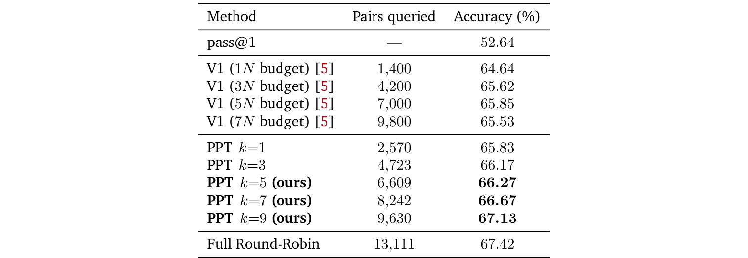
Under a setup with N=20 candidates, 89 tasks, and the Terminus-2 harness (the “harness” being the scaffolding driving the agent — its tool interface, interaction loop, and termination condition):
V1 in the table is the paper’s prior-generation baseline ranking method it compares against; 1N through 7N denote its comparison budget multiplier. Worth flagging up front: the paper never explains anywhere how V1 actually works — it’s used purely as a baseline.
| Method | Pairs queried | Accuracy |
|---|---|---|
| pass@1 | — | 52.64% |
| V1 (1N) | 1,400 | 64.64% |
| V1 (3N) | 4,200 | 65.62% |
| V1 (5N) | 7,000 | 65.85% |
| V1 (7N) | 9,800 | 65.53% |
| PPT k=1 | 2,570 | 65.83% |
| PPT k=5 | 6,609 | 66.27% |
| PPT k=9 | 9,630 | 67.13% |
| Full Round-Robin | 13,111 | 67.42% |
Larger k means higher accuracy but with sharply diminishing returns (k=1 to k=9 only gains 1.3pp while the budget nearly quadruples); by k=9 it’s already approaching full round-robin (67.13% vs. 67.42%) while saving 27% of the budget. The V1 baseline actually gets worse past 5N, while PPT rises monotonically — that part holds up.
But three caveats:
- The paper gives no method for choosing k — it only says larger is better, which just degenerates back into round-robin.
- The savings are smaller than they sound: k=9 only saves 27% relative to round-robin. The O(N²) → O(Nk) asymptotic advantage only becomes visible when N is large enough, and N=20 isn’t there yet.
- This N=20 table is a specially curated setting, and this is the most important caveat. The main experiments only use N=3 to 5, where C(5,2)=10 pairs — PPT barely saves anything at all. In other words, PPT’s actual contribution to those headline SOTA numbers is quite limited.
7 Experimental Results: How You Read Them Matters More Than What They Show
All four benchmarks use the exact same pipeline: a generation strategy produces N candidates per task → the verifier scores them pairwise via PPT → the highest normalized-score candidate is submitted. This pipeline has two key properties:
- Hyperparameters are fixed throughout at G=20, K=8, C=3, with no per-benchmark tuning.
- It’s entirely training-free — all four benchmarks share the same framework with zero domain-specific fine-tuning.
The second point is the most important practical claim. If it holds, it means you can apply this directly to your own domain without needing to prepare any training data.
7.1 The Main Results Table Needs to Be Read in Two Halves

| Benchmark | Baseline #1 | #2 | #3 | Pass@1 | Oracle | Ours |
|---|---|---|---|---|---|---|
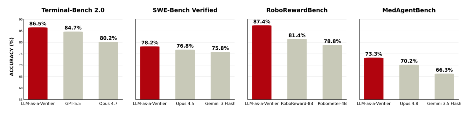
| Terminal-Bench V2 | GPT-5.5 (84.7%) | Opus 4.7 (80.2%) | G3.1 Pro (80.2%) | 83.1% | 92.1% | 86.5% |
| SWE-Bench Verified | Opus 4.5 (76.8%) | G3 Flash (75.8%) | M2.5 (75.8%) | 76.1% | 84.4% | 78.2% |
| MedAgentBench | Opus 4.8 (70.2%) | G3.5 Flash (66.3%) | GPT-5.5 (65.1%) | 70.2% | 75.0% | 73.3% |
(Model names follow the paper’s own abbreviations: “Opus” is the Claude Opus family, and models starting with “G” are Gemini.)
┌─── Left half: other models' scores ───┐  ┌─── Right half: same candidate pool ───┐
│  different harnesses                  │  │  Pass@1 → Oracle → Ours                │
│  different sampling setups            │  │  a fully controlled comparison         │
│  ← comparing apples to oranges        │  │  ← this is what the verifier earns     │
└────────────────────────────────────────┘  └─────────────────────────────────────────┘
The right half is the honest evidence, because it’s the same candidate pool from the same generator, with only one variable changing: “how the pick was made.”
| Benchmark | Pass@1 → Ours | Verifier’s real contribution | Oracle gap | % of gap cashed in |
|---|---|---|---|---|
| Terminal-Bench V2 | 83.1% → 86.5% | +3.4pp | 9.0pp | 38% |
| SWE-Bench Verified | 76.1% → 78.2% | +2.1pp | 8.3pp | 25% |
| MedAgentBench | 70.2% → 73.3% | +3.1pp | 4.8pp | 65% |
Back to the original motivation. On this N=5 candidate pool, the oracle only reaches 92.1%, so the actual headroom up for grabs is 9.0pp, and the verifier cashes in 38% of it; across all three benchmarks, that cash-in ratio ranges from 25% to 65%. As for the 98.9% figure back in Figure 1 — that’s the theoretical ceiling as K grows unbounded, on a different scale entirely from this 9.0pp — it’s the latter number that should actually be used for scoring.
Three issues worth flagging:
- The “SOTA” claim conflates harness differences. 86.5% is GPT-5.5 plus the Capy harness plus N=5 sampling plus the verifier, while 84.7% is GPT-5.5 with a different harness. Three variables differ at once, so attributing the entire gap to the verifier doesn’t hold — the clean comparison is 83.1% → 86.5%.
- RoboRewardBench is entirely missing from this table. The caption claims coverage of four benchmarks, but the table only has three rows. It turns out to be moved to a separate table because it measures preference accuracy instead — but the caption never mentions this.
- SWE-Bench’s candidate pool is heterogeneous. Its N=3 draws one candidate from each of three different models, and Pass@1 is the average across those three models — so the verifier’s actual job here becomes “pick the best across model families.” That’s arguably a more valuable use case (model routing), but it also means this row isn’t directly comparable to the others.
7.2 The Strongest Result Isn’t in the Main Table — It’s in Robotics
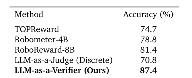
| Method | Accuracy |
|---|---|
| LLM-as-a-Verifier (ours) | 87.4% |
| RoboReward-8B (trained, ~45K episodes) | 81.4% |
| Robometer-4B (trained, ~1M comparisons) | 78.8% |
| TOPReward | 74.7% |
| LLM-as-a-Judge (same VLM, discrete) | 70.8% |
This is far more compelling than the main table, for three reasons:
- A clean same-model comparison. 87.4% and 70.8% are the exact same Qwen 3.6 35B model — the only difference is discrete argmax versus continuous expectation. This 16.6pp gap is the largest and most cleanly attributable number in the entire paper, with zero harness confounding.
- It directly validates the second problem statement. A zero-training framework beats two purpose-trained robotics reward models.
- It’s cross-modal. The input goes from text to multi-frame video, and the method needs no changes at all.
There’s another side result worth remembering: switching RoboReward-8B’s own output to this continuous-formula decoding drops its MAE against human annotation from 1.11 to 0.72. In other words, this decoding scheme can be bolted directly onto an existing reward model — it doesn’t have to fully replace one.
That said, the paper offers zero explanation for why purpose-trained robotics reward models lose on their own home turf. The relevant section just lists the numbers, with no analysis at all. There’s also an undisclosed conflict of interest: RoboRewardBench comes from the RoboReward paper, which shares a co-author with this one, and RoboReward-8B — the model being beaten here — is that same paper’s own model.
8 Progress Tracking: Where the Paper Overreaches
Continuous scores have a second use beyond picking the best candidate: reflecting “how far along is the agent.” The paper defines Value-Order Correlation (VOC), the Spearman rank correlation between “a step’s position in time” and “the verifier’s score for that step’s prefix.” If the score increases perfectly monotonically with step number, VOC approaches 1.
Conceptually this is the same as an RL value function: V(s) estimates “expected return from this state onward,” and should rise as a trajectory gets closer to its goal.
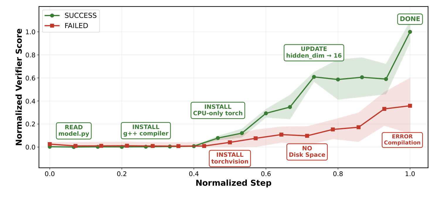
Successful: Read model.py → Install g++ → Install CPU-only torch
            → Update hidden_dim → DONE       score rises steadily → ~1.0
Failed:     unnecessarily installs torchvision → disk space runs out → compile error
                                                score stays low throughout
This chart is genuinely compelling. The problem is that the paper overstates its case here.
The paper claims the verifier’s score stays roughly flat on stalled or failure-bound trajectories, and can therefore serve double duty as both a progress measure and an early-warning signal. But its own statistics don’t support that claim — across 500 Terminal-Bench V2 trajectories:
| Trajectory outcome | Spearman VOC |
|---|---|
| Success | 0.848 ± 0.012 |
| Failure | 0.769 ± 0.016 |
| Gap | +0.079 |
Paper's narrative       Actual numbers
Success: rises ↗        Success: 0.848 ↗
Failure: flat →         Failure: 0.769 ↗ (still climbing steadily)
                         Gap: only 0.079
0.769 is a fairly strong positive correlation, meaning the score on failed trajectories is also rising steadily over time — nowhere close to “flat” (VOC ≈ 0). Figure 10 is a single case from a single task; the table above is the aggregate statistic across 500 trajectories, and the paper chooses to build its narrative around the former while never discussing why the latter’s gap is so small. Using a 0.079 gap for a real-time in-flight warning signal has genuinely weak discriminative power.
The robotics-side VOC numbers do look impressive (this method 0.966, RoboReward-8B 0.877, Robometer-4B 0.780, TOPReward 0.565), but that’s a comparison across different methods, which is a separate question from “can it distinguish success from failure.”
8.1 Side Deliverable: TurboAgent
The paper’s final artifact is an engineering deliverable called TurboAgent — an extension for Claude Code and OpenAI-API-compatible clients, sitting as an inference-time proxy layer between client and LLM provider so that neither side needs modification: every request gets sent out as N parallel candidates, and PPT picks the best one to return. It’s a reasonable idea, but the paper gives it no quantitative evaluation at all — no latency numbers, no cost analysis, no user study. It’s purely a proof of concept.
9 Practical Takeaways
The highest-ROI change: swap your existing LLM-as-judge argmax for reading the top-k logprobs and computing an expectation. A binary or discrete judgment turns into a continuous score, immediately gaining both ranking ability and a confidence level. The precondition is confirming your G falls under the “obtainable from the same API call” reading — that’s the only case where it’s actually free; under the other reading, changing G means re-running the prompt.
The next step is criteria decomposition. Lightweight, and easy to bolt onto any prompt-based judge as-is. But you have to design your own sub-criteria — the paper’s own Specification / Output / Errors trio was designed for reference-free terminal tasks and won’t necessarily transfer, and the paper offers no methodology for designing your own.
Repeated evaluation is the simplest concept, but its cost scales linearly — and remember it only reduces variance, never bias.
The cost needs to be worked out yourself:
LLM calls per trajectory = C × K
Main experiment setting C=3, K=8  →  24 calls per trajectory
Multiply that by however many pairs PPT ends up querying, and the total can get substantial. The paper never discusses latency or cost anywhere — this is a bill you have to compute yourself before adopting it.
One last practical note: if your setting does have ground truth, the core formula is already a single-trajectory scoring form to begin with — pairwise comparison is an add-on, only needed when picking the best of N. You can use the single-trajectory formula alone and put the ground truth into the prompt. In theory this should calibrate better (judging against a reference is easier than reference-free judging), but the paper never validates this use case — every experiment is either “pick the best” or “pairwise comparison,” with no “single trajectory scored against ground truth” experiment anywhere. You can’t assume the 73.1% → 77.5% curve would reproduce here; you’d have to run that ablation yourself. Also note that switching to continuous scores forces you to decide up front what threshold counts as “correct.”
10 Conclusion
This paper’s core insight is small but genuinely solid: an LLM’s internal belief when scoring is continuous — it’s argmax that flattens it. Swap argmax for an expectation, and the tie rate drops from 27% to 0%, restoring the ability to rank.
Nothing here is technically brand new; the value is in systematic packaging and solid ablations. And the two numbers most worth remembering aren’t in the abstract at all: on the robotics benchmark, the same model with only its decoding changed jumps from 70.8% to 87.4% accuracy; applying this same decoding to an existing reward model drops its MAE against human annotation from 1.11 to 0.72. The first is the cleanest causal evidence in the whole paper; the second shows this is a change you can layer on top of what you already have, not something that requires a full swap.
As for the SOTA numbers in the abstract, once you strip out harness differences, the verifier’s real contribution is +2 to 3 percentage points. That’s not a bad margin, but the oracle headroom actually available on these candidate pools is only 5 to 9pp, of which 25% to two-thirds gets cashed in — still some distance from the narrative of “unlocking the oracle’s enormous potential.”