Can You Trust a PDF Parsing Leaderboard? Inside ParseBench

1 Introduction
PDF parsing is going through a subtle change: the parsed content used to be read by people, and increasingly it is fed straight to an AI agent that makes decisions from it. The paper ParseBench: A Document Parsing Benchmark for AI Agents responds to that change by redesigning how parsing is scored.
It is not a new parsing model, and not even a new parsing method. What it proposes is a new way of scoring how well “PDF to structured content” is done. The authors are from the LlamaIndex / LlamaParse team, and the paper also crowns their own LlamaParse the winner, which I come back to later.
The verdict first, so you don’t have to read to the end to know whether it’s worth it: this paper has low research value and high engineering value, and the value lies in the thinking behind the scoring design, not in the leaderboard numbers. If you are short on time, jump straight to “How Tables Are Scored” and “Three Techniques Worth Taking Away”.
2 The Reader Changed, and Why Old Metrics Fail
The paper’s core observation is plain: the consumer of document parsing has changed. The old bar was “good enough for a person to read”; the new bar is “reliable enough for an agent to act on”. That sounds abstract, but the examples the paper gives are concrete:
- A table header is misaligned, so an agent underwriting an insurance claim picks up the wrong number.
- A chart is flattened into a run of plain text, so the agent has no numbers to compute with.
- A strikethrough is dropped by the parser, so the agent treats a cancelled old quote as the current price.
- A superscript is flattened into ordinary text, so the footnote marker “1” is read by the agent as the quantity “1”.
All four share one trait: a text-similarity metric cannot see the problem at all. Almost every character is right and the meaning is completely wrong. The paper names the requirement that the meaning be right semantic correctness. It is the most important concept in the paper, and every dimension that follows is designed around it.
The paper criticizes existing benchmarks on two counts: the document distribution is wrong (mostly academic papers or clean screenshots, not the documents that actually drive enterprise automation), and the metrics are wrong (they compare surface text similarity and miss structural failures).
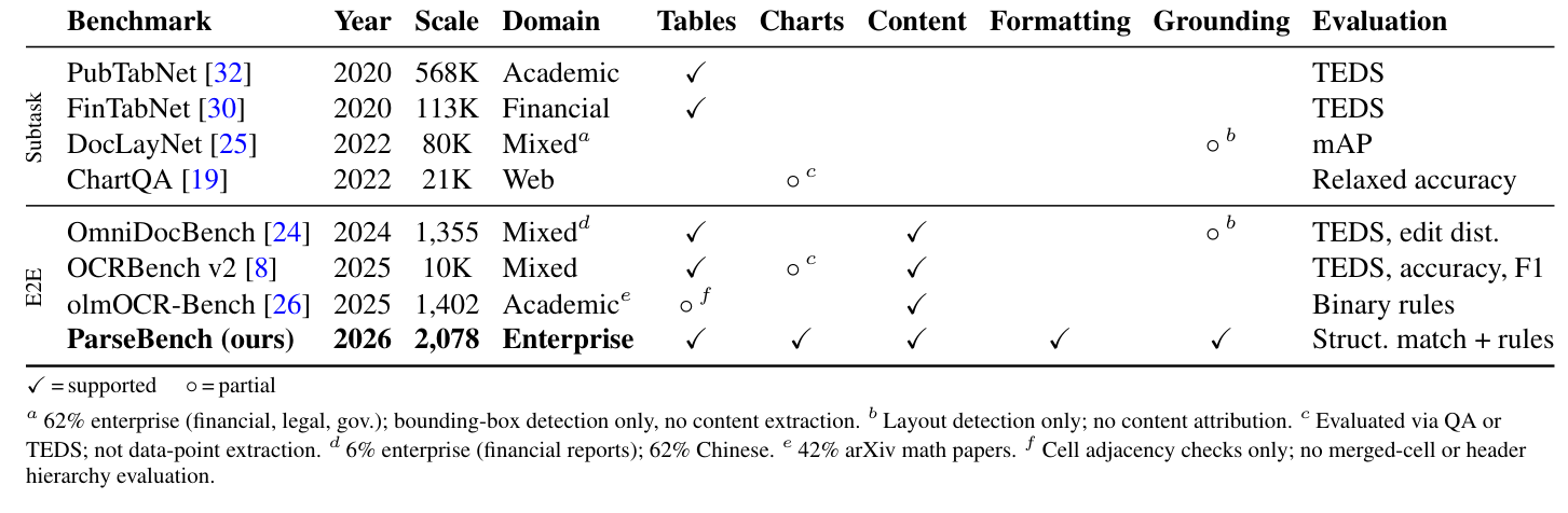
The footnotes of this table are actually more damning than the table itself: OmniDocBench is only 6% enterprise documents and 62% Chinese; olmOCR-Bench is 42% arXiv math papers; DocLayNet only does bounding-box detection and no content extraction at all. In other words, using these benchmarks to judge “can this be fed to an enterprise agent” was never going to fit.
3 ParseBench’s Five Dimensions, and One Detail to State Up Front
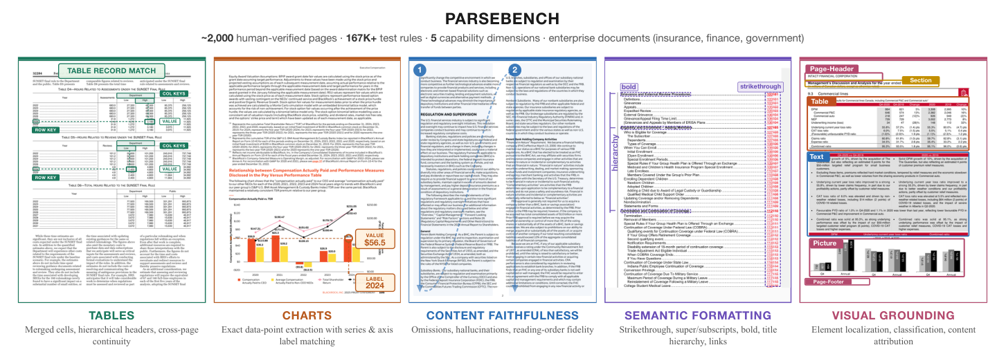
ParseBench splits “semantic correctness” into five dimensions, each matching a failure mode that really does break production agent workflows:
- Tables: merged cells, hierarchical headers, tables that continue across pages.
- Charts: recover a chart as precise data points, not a text description.
- Content faithfulness: dropped text, hallucination, reading order.
- Formatting: strikethrough, superscript and subscript, bold, hyperlinks.
- Visual grounding: can each extracted element be traced back to its original position on the page; the motivation here is auditing.
In total the scale is 2,078 pages, 1,180 documents and 169,011 rules.
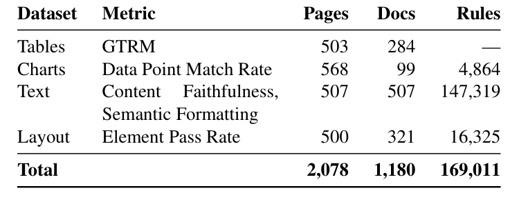
Two details are easy to gloss over in the marketing language, though. The content faithfulness and formatting dimensions share the same 507 documents and only apply different rule sets, so the “five dimensions” correspond to only four datasets. And 87% of those 169K rules sit in the text dataset: “169K test rules” sounds impressive, but most of that volume is text-matching rules expanded automatically, not 169K independently designed test points.
4 How Tables Are Scored: From TEDS and GriTS to TableRecordMatch
This is the most substantial part of the paper. I’ll cover the two older metrics first as groundwork, then the paper’s own new proposal.
4.1 Two Older Metrics: TEDS and GriTS
TEDS (Tree Edit Distance based Similarity) comes from the PubTabNet paper, and its worldview is that a table is a tree: table has a row of tr elements under it, and each row has a row of td cells. The question it asks is “what is the minimum cost to turn the predicted tree into the correct one”. Inserting or deleting a node costs 1; replacing a node costs 1 if the tags differ, and if only the text differs, the cost is the normalized edit distance between the two strings (between 0 and 1).
The key point is that “the cost of a replacement is the text’s edit distance”, which I’ll use later when explaining an absurdly high score.
GriTS (Grid Table Similarity) comes from Microsoft’s Table Transformer team, and its worldview is that a table is a matrix: find the best correspondence that preserves both row order and column order, then compare every pair of cells that line up. The scoring uses an F-score-like formula whose denominator is the sum of the two sides’ cell counts, so extra cells on either side dilute the score. Note the “preserve order” constraint: it is exactly why GriTS penalizes column reordering heavily, even when reordering does not change the table’s meaning at all.
The two metrics share a blind spot: they treat header cells and data cells alike. To them a header is just “another cell”, with no notion that “a header defines the meaning of a whole column of data”.
4.2 TableRecordMatch: Treat a Table as a Bag of Records
The paper’s TableRecordMatch (TRM) is meant to plug that hole. It reads a table not as “an arrangement of cells” but as “a bag of records”: each row becomes a record, and every value in the record uses the header of its column as its key. “Bag” means unordered: however the rows or columns are arranged, the contents of the bag are the same, which is why it is insensitive to ordering. Conversely, once a header is dropped or misplaced, every value’s key changes and the whole bag of records fails to match, which is exactly the penalty it wants. The idea actually comes from relational databases (a row is a record with named fields), and the math is a variant of Jaccard similarity.
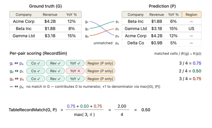
The formula looks like this:
is the bag of ground-truth records and is the bag of predicted ones. The two are first put into a best matching, then is computed pair by pair. A worked example is easier to follow than the formula: the ground truth has three records (Acme, Beta, Gamma, each with the three fields Company / Revenue / YoY%). The prediction has four records, with an extra Region column, plus a made-up Delta record out of nowhere, and Beta’s YoY% is wrongly written as 6% instead of 8%. After comparing record by record, the three matched pairs score 0.75, 0.50 and 0.75 (all diluted by the union because of the extra Region column), and the Delta record, which matches no ground-truth record, contributes 0. The sum divided by gives a final TRM of only 0.50.
This example shows two kinds of penalty at once: a field-level penalty (the union denominator symmetrically penalizes extra or missing fields, and a dropped header goes down exactly this “one field short” path) and a record-level penalty (the denominator is 4, not 3, so the superfluous Delta takes up a slot for nothing and adds nothing to the numerator).
4.3 TRM’s Implementation Gaps and GTRM
To be honest, though, if you want to implement TRM yourself, the paper gives you a scoring philosophy, not a reproducible spec. Three key details are never stated: what objective the matching optimizes and which algorithm solves it (if it is maximum-weight bipartite matching, the standard solution is the Hungarian algorithm, but that is my inference and the paper does not say so), and how field keys are compared, that is, whether header strings must match exactly or fuzzy matching is allowed (case, whitespace, Revenue versus Revenue (USD)). That last one bites hardest in practice: if it is strict string equality, a parser that merely adds a unit symbol to a header sinks the whole table. It also means someone who implements TRM independently may not reproduce the numbers in the paper’s tables.
The “Tables” column in the main results table is actually not pure TRM but GTRM, that is , unweighted, 50% each. The contradiction is that the paper spends a whole passage arguing GriTS / TEDS are unsuited to modern production use, and the appendix gives examples that back the criticism, yet it puts the metric that “can give a wrong 0.998” into the final score at 50% weight. The paper’s entire explanation of this decision is one sentence, “we combine both perspectives into a single score”, with no account of why to combine them or why 50/50.
4.4 Two Contrasting Examples from the Appendix
Two contrasting examples in the appendix make this contradiction concrete:
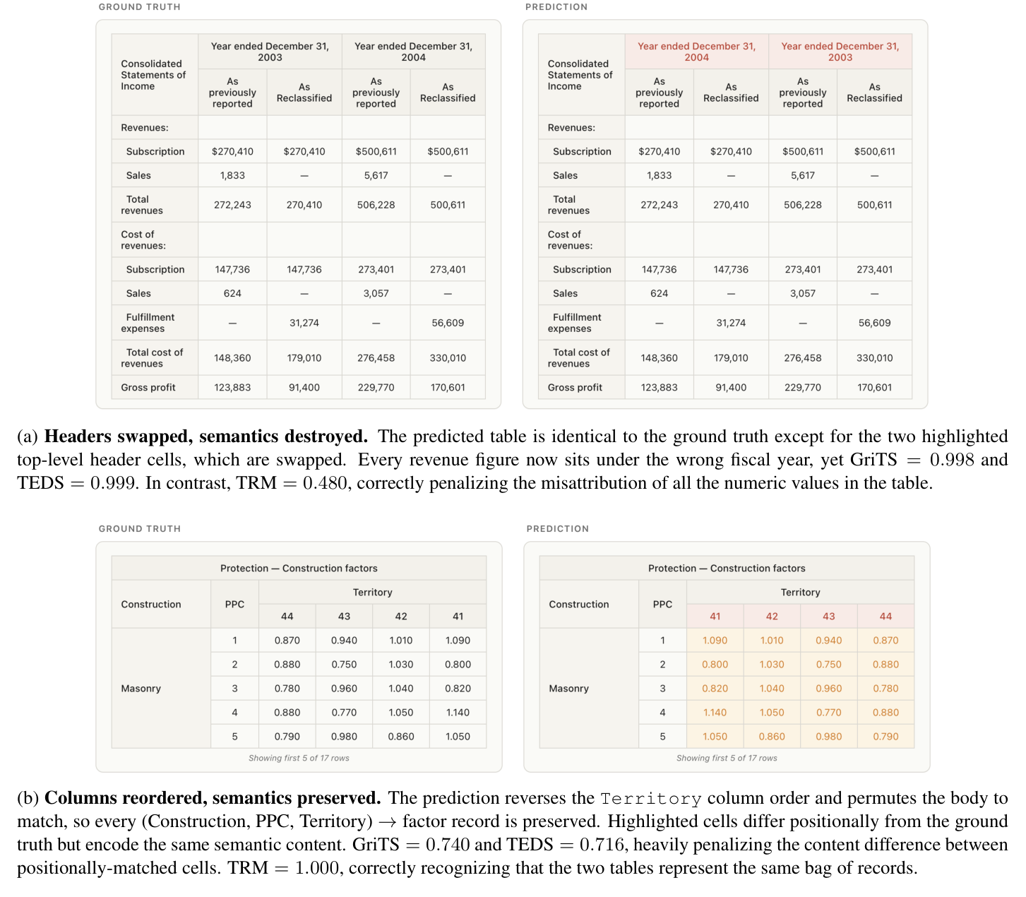
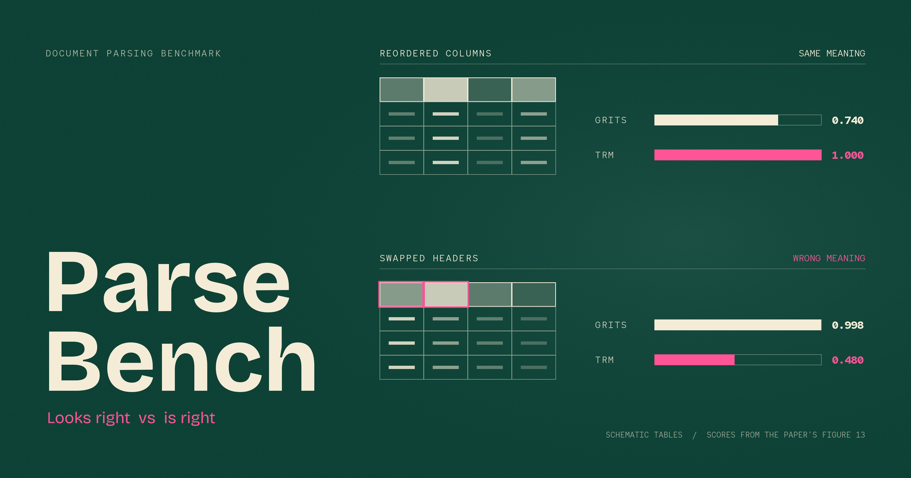
In (a) the headers are swapped so every number hangs under the wrong year; GriTS gives 0.998 and TEDS gives 0.999, while TRM gives only 0.480. In (b) the column order is rearranged with exactly equivalent meaning; GriTS gives 0.740, TEDS gives 0.716 and TRM gives a perfect 1.000. These numbers turn “the existing metrics have a problem” from a claim into a fact, and they are the most memorable evidence in the paper.
Why can (a) get an absurd 0.999? Because the two swapped headers are “Year ended December 31, 2003” and “Year ended December 31, 2004”: of 28 characters, only 1 differs. Each replacement costs about , the two add up to about 0.071, and the table has roughly 60 to 70 nodes, so . This breakdown is my own derivation from the TEDS definition. The paper only gives the 0.999 result, but the derivation explains neatly why the score is so high. Semantically, every number in the whole financial report hangs under the wrong year; mathematically, it is an edit distance of 0.07. Incidentally, the paper actually made an adjustment in TEDS’s favor (it first downgrades header cells to ordinary data cells, because TEDS by default does not compare header content), so “0.999” is already the adjusted figure, and without the adjustment it would only be more lenient.
4.5 Two Kinds of Table Where TRM Breaks
TRM is not universal either. Its whole premise is that “one row is one record, and keys come from the column headers above”, and when that premise breaks, it fails. The first case is a table with non-contiguous section-title rows inserted in the middle (for example grouped by region). TRM treats the section title as an ordinary record, so the information “belongs to North America” disappears entirely, and if two regions happen to have companies with identical numbers, the two records become completely indistinguishable, because TRM is an unordered bag that does not even look at ordering.
The second case is a table with both top and left headers (for example rows are Revenue / Cost and columns are Q1 / Q2 / Q3). Each value in such a table needs two headers to be defined, but TRM only recognizes column headers, so the row header is demoted to an ordinary value. There is a rather ironic inference here: transposing such a table leaves the meaning exactly equivalent, but after the transpose the whole set of keys changes, so TRM would give close to 0. The “insensitive to ordering” property it is proudest of fails precisely on this kind of table. The paper’s handling of these two kinds of case is to flag them by manual review and always report GriTS instead. That is consistent and fairly honest, but it does not say what share of tables these are, so how much of the main table’s “Tables” column is pure GriTS contribution cannot be known.
5 How Charts Are Scored: ChartDataPointMatch Spot-Checks Data Points
Charts are scored with entirely different logic. The paper’s reason is that annotating a full ground-truth table for every chart is “expensive and brittle”, since reading a chart is inherently subjective: for a stock-price line, should the points be daily, weekly or monthly?
So it switches to spot checks: each chart is annotated with at most 10 data points, and each point carries the labels that must appear together (series name, x-axis category, chart title), the expected value and a tolerance. The metric is the fraction of data points that verify successfully, with no formula. As for the tolerance: charts with explicitly printed numbers use exact matching, and charts without printed numbers that must be estimated by eye use a relative tolerance, 1% by default, but in practice the tolerance is decided point by point by annotators.
A concrete example shows how the tolerance follows how hard the chart is to read:

In the same chart, the point with value 10 gets only a 10% tolerance (accepted range [9, 11]), while another point with value just 3 gets a tolerance as wide as 50% (accepted range [1.5, 4.5]), because that bar is very short in a 3D chart and hard to read precisely.
Verification has four steps: first extract Markdown or HTML tables from the output; then use the surrounding text (bold, headings, captions) to locate the relevant table; then use fuzzy matching plus numeric normalization to find the value (currency symbols, k/M/B suffixes and thousands separators are all stripped, so $1,234K, 1234000 and 1.234M are treated as the same number); and finally confirm the remaining labels are correctly associated with that value. The clever part of this design is that it is completely insensitive to the output table’s format: the appendix shows four providers outputting the same chart in four entirely different structures (horizontal, vertical, Markdown, HTML) with no effect on the score, because it only cares whether “the labels and the value appear together”.
The places to discount are just as clear. The tolerance is decided by hand point by point, the paper gives only two examples and does not publish the overall tolerance distribution, so this is a degree of freedom that is never quantified. And spot-checking 10 points does not mean the whole chart is right: for a chart with 40 data points, getting 10 right only shows those 10 are right, and the paper does not discuss this.
6 Content Faithfulness: Two-Level Averaging So Count Doesn’t Decide Weight
The paper calls this the “most fundamental, most table-stakes” dimension: dropped text, hallucination or wrong order pollutes the agent’s whole context. The rules fall into two groups: text correctness (dropped text, hallucination, whether a snippet should or should not be present, digit frequency distribution) and reading order (each rule names two text snippets, “before” and “after”, and passes if the first occurrence of before comes earlier than the last occurrence of after). Using “first” against “last”, rather than the first of both, is because some snippets repeat (for example a title that also appears in the table of contents), so this avoids wrongly judging the body order as wrong because of a repetition the parser cannot control.
Two-level averaging is the real design highlight of this section, and the problem it solves is intuitive: a densely typeset document may have 500 dropped-text rules but only 3 hallucination rules, and if everything is thrown into one average, dropped text completely drowns out hallucination. The fix is to average first within the same rule type (the 500 dropped-text rules compress into one number), then average across types (the dropped-text number and the hallucination number are averaged with equal weight), so count no longer equals voice. When composing the final score, text correctness has weight 1.0 and reading order 0.5. The paper says this is because text correctness is the more critical failure mode, but honestly this ratio has no stated basis or sensitivity analysis.
A single total score hides different failure modes, which is especially clear in this example:

Textract’s problem is duplicated content, Haiku 4.5 hallucinates and jumbles column order, and Extend reads across columns row-wise. Three entirely different ailments, but from a single total score you could not tell which one it is. That is exactly the value of splitting into sub-scores.
The data for this dimension is 500 PDFs fetched at random from the web, one page from each, with pages heavy on tables and charts deliberately excluded. Content faithfulness and formatting use the same documents and only apply different rule sets:
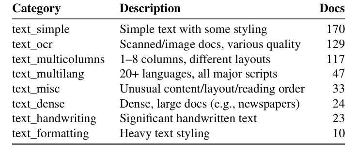
The category distribution is very uneven: heavy typesetting (text_formatting) has only 10 documents, and the same documents are also used to evaluate the formatting dimension, so judging the “heavy formatting” ability from 10 documents is clearly a thin sample.
Incidentally, the bag_of_digit_percent rule is dedicated to catching digit misreads (for example OCR reading a 6 as an 8). It counts how many times each digit appears in the output and compares that with the ground-truth distribution. The paper itself admits it can only miss when two digits happen to have exactly the same frequency and happen to be swapped in both directions, a fairly demanding condition, so accepting this limitation is reasonable. But there is a bigger hole the paper does not mention: this rule does not look at position at all, so “Revenue 2.0M USD, Cost 0.2M USD” output as “Revenue 0.2M USD, Cost 2.0M USD” has an identical digit distribution and passes straight through. Ironically, the paper opens with “2.0% read as 0.2%” as its core motivating case, saying this kind of error would completely distort downstream financial models, yet its own digit-level check is blind to exactly this kind of positional swap.
7 Formatting: Catching Meaningful Formatting, but One Formula Is Backwards
This dimension tests only formatting that carries meaning, not pure decoration: strikethrough marks content that has been voided (drop it and the agent treats the old price as the current one), superscripts and subscripts correspond to footnotes or chemical formulas (flatten them and x² becomes x2), and bold marks defined terms or key values.
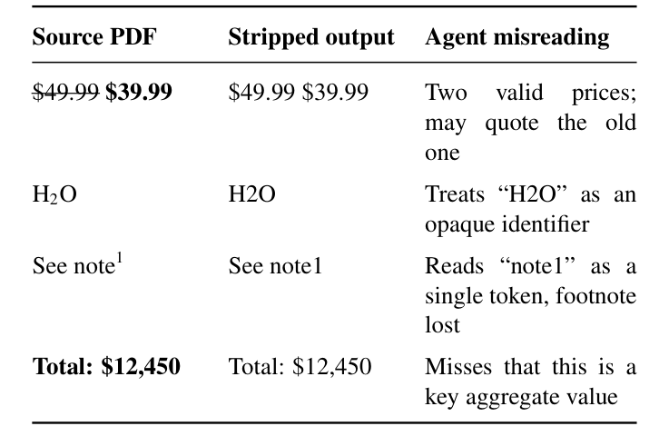
Every category is designed with a positive and a negative rule in pairs: is_strikeout catches “should be marked but isn’t”, and is_not_strikeout catches “shouldn’t be marked but was added”. Testing only the positive rewards “mark everything”, and testing only the negative rewards “mark nothing”, so paired testing is the fair way.
The sub-score uses a weighted harmonic mean, in the same form as the F-score, except that precision / recall are replaced by the average pass rates of the positive rules and the negative rules respectively. The intent of the harmonic mean is right: if either side is very low, the total is pulled down, which an arithmetic mean would not do (positive 1.0 and negative 0.0 still averages 0.5 arithmetically, while the harmonic mean tends toward 0).
But plugging in numbers shows that the formula itself is backwards. The paper says setting is meant to “penalize false styling more heavily than missed styling”. Calculated for real, the scenario where positives are all right and negatives are poor scores 0.833, while the scenario where positives are poor and negatives all right scores only 0.556. This means the formula actually penalizes “missed” harder than “added”, the exact opposite of what the paper claims. The reason is that in the standard F-score, up-weights the quantity that does not have the term in the denominator, and the paper puts the positive pass rate in that position, so what gets up-weighted is the positive rules. To achieve the effect the paper claims, should be greater than 1. This is an inconsistency between the paper’s own formula and its text description; either the formula or the explanation may be wrong, and the paper gives no numerical demonstration to tell which.
This dimension also has a more fundamental concern, which an infographic example makes especially clear:

One model got all the text right but output HTML tags (<h3>, <strong>) instead of Markdown syntax, while the rule expects **text**, so its whole styling score went straight to zero. For a model that correctly recognizes <strong>, it is hard to say it “doesn’t understand semantic formatting”: its output format just doesn’t match what the rule expects. This also partly explains where the near-zero scores in the main table come from.
8 Visual Grounding: All Three Stages Must Pass, and Why IoA Instead of IoU
This dimension tests whether each extracted element can be traced back to the correct region on the page. The paper has a line that makes the point well: a parser can perfectly well produce Markdown that reads correctly and still fail completely at visual grounding, because it attached the right text to the wrong region.
8.1 Scoring and IoA
The score is three stages multiplied together, and if any one fails everything goes to zero: localization (whether IoA passes), classification (whether the label is right) and content attribution (where applicable, whether tokens match). The paper says plainly that it avoids averaging because “averaging over-rewards partial successes that still break traceability”.
The choice of localization method is the most pragmatic technical decision in the paper: it uses IoA rather than the usual IoU. IoU is symmetric, with the union of the two regions as the denominator; IoA is asymmetric, with only one side’s own area as the denominator. In document parsing “splitting” and “merging” are routine: for the same large block of text, system A outputs 1 box and system B outputs 3 small boxes, and neither is wrong, but IoU penalizes the difference heavily because the union gets inflated, while IoA, with a one-sided area as the denominator, tolerates it. The paper uses thresholds in two directions: at least half of the ground truth must be covered by predicted boxes (requiring substantial coverage), and at least 20% of a predicted box must fall inside the ground truth (blocking the cheat of one box covering the whole page). The thresholds are set this loosely precisely to tolerate splitting.
Content attribution has its own set of thresholds: candidate boxes are first collected with a looser IoA (at least 30% inside the ground truth), then compared after text normalization. Ordinary elements need a token-level F1 of 0.80 to pass, and chart-type elements use recall of 0.80 instead, because some value labels inside a chart simply cannot be exhaustively described in every reasonable way. Capturing what should be captured counts as a pass, and extra content is not penalized.
8.2 The Cliff Effect, and Why Binary on Purpose
The price is a cliff effect: an IoA of 0.51 passes and scores 1, while 0.49 fails and scores 0, so two boxes drawn almost identically can differ by 100% in score. This dimension has four thresholds in all (0.50, 0.20, 0.30, 0.80), and the three stages multiply, so any small tweak to a threshold is amplified. The paper did no sensitivity analysis and does not explain how the thresholds were set.
Why design it as three stages multiplied instead of using a continuous score like IoA directly? Because the classification stage has no continuous score to use at all: you cannot say a Table labeled as a Picture is “70% correctly classified”. Since one stage in the middle can only be a binary decision, chaining them means unifying everything to binary, and in a multiplicative chain, as soon as one stage is binary, the continuity of the whole chain is actually fake: a localization of 0.9 with a wrong classification still counts as 0, and a localization of only 0.3 with a wrong classification also counts as 0. The more fundamental reason is that this metric asks “is it usable” rather than “how close is it”. Auditing is inherently a binary question: either an element can be traced back to its original position or it can’t, and “IoA 0.45, so we traced back 45%” means nothing for auditing. The appendix does keep continuous versions as diagnostic metrics, and the paper says clearly that these are diagnostic summaries to aid interpretation, not independent items to be averaged into the main score. The main metric is deliberately binary and the continuous information stays on the side as diagnostics, which is actually a reasonable division of labor.
9 Is It Open Source? The Scoring Method Is Free, the Top-Scoring Product Is Paid
Whether it is open source has to be viewed in three layers, with completely different answers. The scoring method (the formulas above) is written out clearly in the paper, is public, and can be implemented yourself with no license. The dataset plus evaluation code are, per the paper, open-sourced on HuggingFace and GitHub and can be used to run your own parser (but I have not verified the actual repo state or license terms; this is the paper’s own claim). As for LlamaParse itself, which took first place, it is not open source and is a paid API.
This reflects an important fact: the “method” this paper proposes is a scoring method, not a parsing method, and it tells you nothing about how to parse PDFs better. The paper’s description of its own system is a single sentence: a multi-step pipeline that orchestrates VLMs, combines specialized tools and refines iteratively, with no implementation details, no architecture diagram and no prompt. The appendix instead pastes the full prompts of every competitor and not one word of its own. Put bluntly, the scoring rules are a gift, but the product that scores well costs money.
10 The Leaderboard: How Much to Discount 84.9%
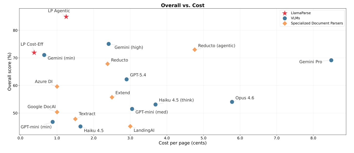
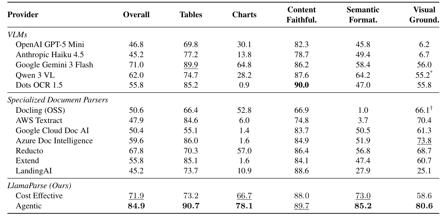
The paper’s claimed result is that LlamaParse Agentic leads at 84.9%, and the strongest external competitors are Gemini 3 Flash (71.0%) and Reducto (67.8%). There are three reasons to discount this first place.
First, it is the vendor’s own benchmark, and the authors’ email addresses are all @runllama.ai: they set the questions, set the scoring standard and took first place themselves. The paper is aware of this and writes a line, “we encourage independent reproduction; if outside parties get stronger results, that confirms the benchmark is useful rather than undermining it”. It is nicely put, but it does not change the fact that every design choice in the scoring rules was theirs.
Second, the things being compared are not on equal footing: competitors’ VLMs are called once with a single prompt, commercial parsers use default settings, and their own system is a multi-step, tool-equipped, iteratively refining agent pipeline. It is unsurprising that an agent pipeline beats a single inference call. This is not a comparison of model capability but of “system versus single call”. The paper itself offers supporting evidence: another competitor, after switching to agentic mode, gained 5 points overall, 10 on tables and 16 on charts. The act of “switching to agentic” is itself worth a lot, regardless of who built it.
Third, Overall is the unweighted mean of five dimensions, and on charts and semantic formatting most competitors score near 0 (some traditional parsers score only 1 to 6 on charts). This is not a capability gap but a gap in “whether the feature exists at all”: traditional IDP products never set out to turn charts into data tables.
If you look only at the three dimensions everyone actually works on (tables, content faithfulness, visual grounding), LlamaParse Agentic’s three-dimension mean is 87.0 and the best external competitor (here switching to Azure DI) is 81.6. The gap shrinks from 13.9 points on five dimensions to 5.4, and the identity of the strongest competitor changes too. The lead is still real, just not as dramatic as the leaderboard makes it look.
The cost frontier chart (Figure 5 above) also needs reservations: the paper’s own costs are internal figures, which are not the same kind of thing as other vendors’ public list prices, so the chart is for glancing at only.
Beyond the ranking, the paper does mention a phenomenon more worth keeping in mind: VLMs are good at content-level understanding, specialized parsers are good at structure and layout-aware extraction, and a downstream document agent needs both. It also notes a concrete failure pattern: single-call VLMs almost entirely collapse on visual grounding, some scoring only 6, and the cause is not that boxes are drawn slightly off but that they output “coarse page-level blocks” and are not doing element-level decomposition at all. Asking a VLM to output content and dozens of bounding boxes in a single call is too heavy a task for it.
11 Three Techniques Worth Taking Away
First, be clear about what kind of paper this is: it is an engineering artifact, not a theoretical framework. The five dimensions each use a completely different scoring mechanism with no shared mathematical basis, and each one has hand-picked constants stuffed in: GTRM’s 50/50, content faithfulness’s 1.0/0.5, the formatting dimension’s , and visual grounding’s four IoA thresholds, none of which comes with a justification or sensitivity analysis. So the way to read it is not to remember it as a whole, but to pick a few useful techniques to take away.
The only through-line is this: when the downstream consumer changes from “person” to “agent”, the scoring standard has to change from “does it look similar” to “is the meaning right”. The sentence itself is not new, but the paper turns it into executable metrics, which is its real contribution. Three techniques you can lift directly:
① TableRecordMatch’s conceptual shift: reinterpret a table from “an arrangement of cells” into “a bag of records keyed by header”. Taken apart, there are two design tricks usable on their own: use a union denominator, which penalizes both extra and missing fields; and use the larger of the two sides’ record counts as the denominator, which penalizes superfluous records. This is the only truly new way of looking at things in the paper, not just a new algorithm.
② Two-level averaging, to fix uneven rule counts. If the scoring is built on a pile of checks with wildly different counts (500 dropped-text rules versus 3 hallucination rules), average within each type first and then across types, so count no longer equals voice. This technique has nothing to do with document parsing and works for any rule-based evaluation.
③ Test “what should pass” and “what should not be misjudged” in pairs, as is_strikeout must be paired with is_not_strikeout. Testing only the positive rewards “mark everything”, and testing only the negative rewards “mark nothing”; pairing them with a harmonic mean means the total collapses if either side collapses. One caution, though: the direction of the paper’s is computed wrong, so if you really want to use this trick, re-derive it yourself.
The failure modes of TEDS / GriTS (swapped headers earning 0.999, a column reordering with equivalent meaning scoring only 0.740) are a good lesson in “the metric doesn’t match the task”. But to be fair, TEDS and GriTS are not bad metrics. They were designed for “table structure recognition”, a task that cares about where the grid lines are and whether merged cells are right, and in that context they are perfectly reasonable. The problem is that the task changed, not that the metrics are wrong.
As for the leaderboard numbers, LlamaParse’s own approach (which the paper does not describe in a single word), the cost frontier chart and that pile of hand-picked constants, none of that needs to be taken too seriously, and any use of them requires recalibrating yourself.
12 Conclusion
The paper takes the sentence “the scoring standard should change from looking similar to being right” and lands it as five sets of executable metrics, which is its real, defensible contribution. The truly valuable parts are concentrated: TableRecordMatch’s reinterpretation of a table as a bag of records, the two-level averaging that fixes uneven rule counts, and the paired positive/negative test design. All three are just as usable in other evaluation settings. As for the 84.9% first place on the leaderboard, remember that it comes from a vendor-written benchmark, pits an agent pipeline against single calls, and uses an unweighted average that magnifies features competitors never built. After the discounts, the lead shrinks from 13.9 points to 5.4. The part of the paper worth reading is probably only about twenty percent of it.